Pictures of the EcQ
Thanks to Jared I found out my Mac at home actually had an easy to use Grapher program. So...
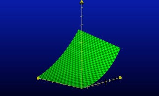
I've spend some time fiddling with the program and plotting the EcQ. Jared's picture from the prior post was an unconstrained plot for all values of X and Y. But, since our MET and SIT terms only go from 0.0 to 1.0, only a part of that picture is really in play. These pictures show the relevant part of the function.
First, here's an angle from behind the EcQ (vertical) axis. The SIT score runs out toward the left and the MET score runs out toward the right:

Looking at the graph you can see that the EcQ captures the theology I intended. First, note that if your MET (Moral Exemplar Term) is zero your EcQ stays pegged at zero no matter how high (or low) your SIT (Social Influence Term) gets. Thus, no matter how socially influential you are, if you are a poor moral example your ecclesial contribution is zip.
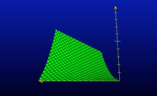
Second, look at the next picture. Here the SIT axis is now running from your right to left and the MET is running away from you (i.e, increasing). Thus, as your MET increases your EcQ begins to take off. But note that the rise on the right side of the graph pegs out much lower than the rise on the left side.

This lopsidedness is due to the fact that on the right side of the graph your Social Influence Term is low and on the left side it is higher. Thus, although a high MET score results in a net positive EcQ, having a high SIT--you have a lot of social Oomph--yields a greater score.
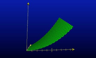
In this final picture, the MET axis now faces you, increasing from left to right. This angle nicely shows the peak of the High MET/Low SIT person compared to the peak (seen in the far distance) of the High MET and High SIT person.

Overall, then, I'm theologically satisfied with the shape of the EcQ function.
P.S. Thanks for indulging me about the EcQ. I'm now finished with it. Have a great weekend!


